
Jumping Jacques: A Frog Legs Food Truck!
Jumping Jacques is a food truck concept serving up frog legs in your favorite wing sauce. The idea originally sparked as a fictitious career alternative for Aaron Lozier, the CTO at Potenza. Whenever he is at his wit's end with computer code he often laments "Maybe I should just start a food truck". Depending on how many more bugs Aaron finds we may see this truck on the streets soon.
Inspiration Board:
The name Jacques was the only thread needed to tie it to a wild backstory about a frog that had his leg taken by a hungry pirate. That backstory was the creative inspiration and resulted in the “old world” art direction. I looked at other brands that went in similar directions like popular whiskeys, and Bar and Grill Restaurants. I wanted to take inventory of the elements that gave it that distinct look.

Initial Ideas & Sketches:
Once we figured out our direction the sketchbook came out. I wanted to run through a few ideas and begin brainstorming how we could be the "Captin Morgan" of buffalo frog legs.

Type Treatment:
The character/icon was very important to make this brand stand out but I also wanted to look at different type options we could start with and integrate into this brand. I wanted something that would work as a stand-alone but also pair nicely with our friend "Jacque".

Original Concepts:
After all of my initial thoughts and ideas were laid out on the table it was time to start piecing everything together.

Option 1:
In our first concept, I dove head first and took on the challenge of creating a pirate/frog hybrid. This initial concept is probably better suited for a future Fun Jump business but it did set the course for our final direction.
Option 2:
Our Second Concept was to play down the cartoon side of things and use more of a realistic visual. When we looked at this idea, there was something to be said for some of the styling choices however the first concept still had a unique appeal we couldn't ignore.
Variation Sketches:
Taking everything I learned up to this point I went back to my sketchbook to see what else we could do to make "Jacque" become the captain of this new ship food truck.

Color Study:
Not only was I thinking about what the logo could look like I was wanting to start thinking about what color options we could tap into. I looked at various frog photos and illustrations and came up with 4 palettes that I felt could work with the vision we had set.

Refined Directions:
Option 1:
For the first option, I pulled inspiration from the chunky features of a Toad. I wanted a compact yet an appealing character that felt larger than life even in his small stature.

Style Variations:
With the initial concepts, we learned that there was something special about the styling choices in all of the varying whiskey brands and microbrews I looked at and I wanted to see how I could transform our icon from a cartoon to something more sophisticated.

Option 2:
With this next version, I wanted to go in the opposite direction and see what "Jacque" would look like with longer limbs and a little more of a pep in his step.

Style Variations:

Illustration Refinement:
After everything was said and done we really felt like the taller character had more of a leg to stand on. Before we could call it finished we took it through a few more rounds of refinement. The initial face reminded us more of a lizard than a frog. One of the things we loved most in the shorter character above was that there was no question it was a frog.
With this information at hand, I started piecing the ideas we liked from both and continued to evolve our good friend "Jacque".

Final Logo Direction:
After a few weeks of hard work and some great constructive criticism/conversations, we finally found the best Frog to represent this new Brand. We present to you Jumping Jacques!
Main Logo - Full Color:
Main Logo - One Color (Dark on Light):
Main Logo - One Color (Light on Dark):
Secondary Logo - Stand Along Type Treatment:

Brand in Application:
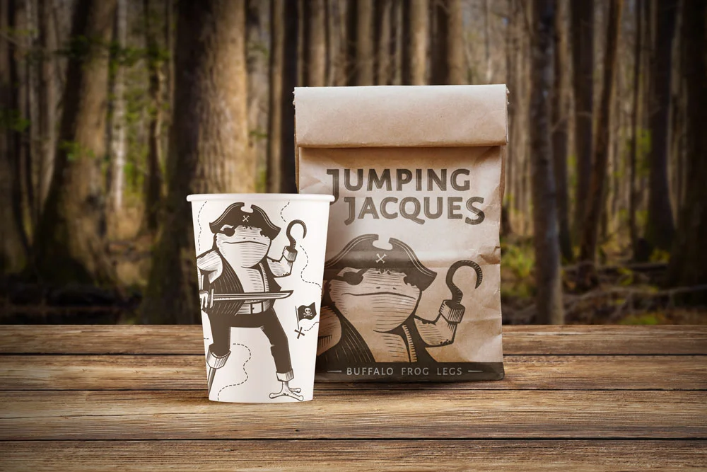
To-Go Cup & Bag Design:
Staff Apron:

Food Truck:
