
MatrixGold
Brand & Visual Identity
Unifying Two Industry Leaders Into One Modern Software Brand

Overview
Brand strategy and identity development for a next-generation jewelry CAD platform
MatrixGold began as the merging of two established products in the jewelry design industry — Matrix and RhinoGold. What started as a technical consolidation evolved into the launch of an entirely new flagship platform under the Gemvision business unit at Stuller.
I partnered closely with the Gemvision team to establish the creative direction, develop the logo and brand system, and build the visual world for launch. My role centered on shaping how this new product would be introduced, positioned, and adopted by a loyal and technically sophisticated user base.
The foundation created during this phase continues to influence how the MatrixGold brand evolves today.
The Challenge
Merge two respected platforms without losing trust or momentum
Matrix and RhinoGold each had strong brand equity and dedicated user communities. Combining them required more than feature alignment — it required clarity, confidence, and a unified identity.
We needed to:
• Honor the legacy of both products
• Reassure long-time users
• Signal meaningful innovation
• Establish a scalable brand system for future expansion
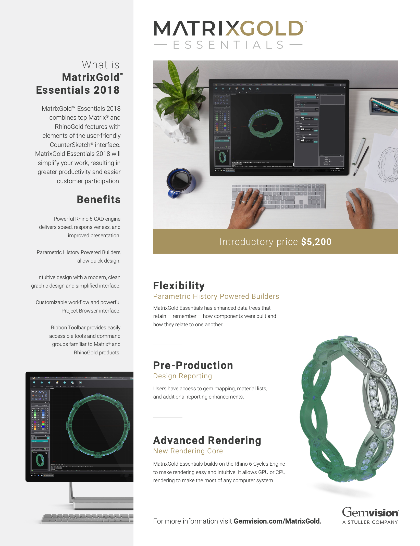
• Differentiate product tiers including MatrixGold Essentials and the full MatrixGold platform
This was not simply a rebrand. It was a repositioning of leadership in digital jewelry design.
Positioning MatrixGold as the future
of jewelry CAD
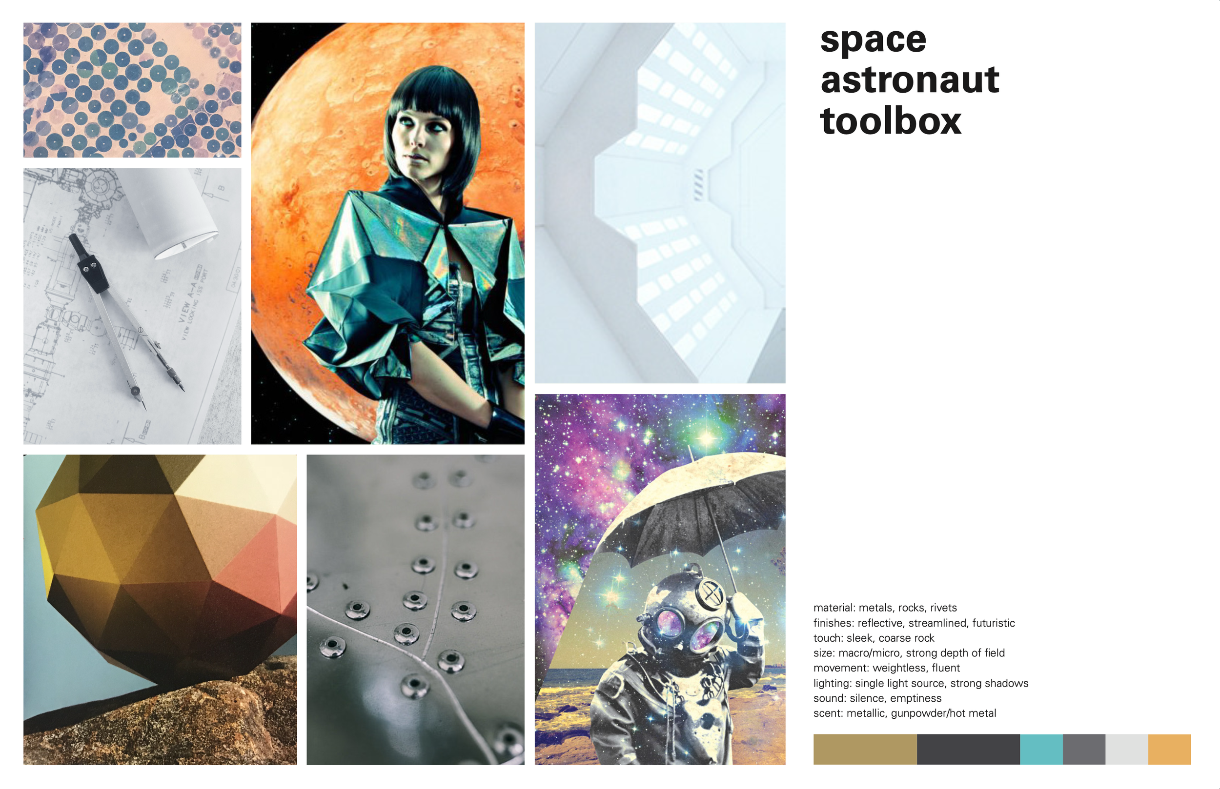
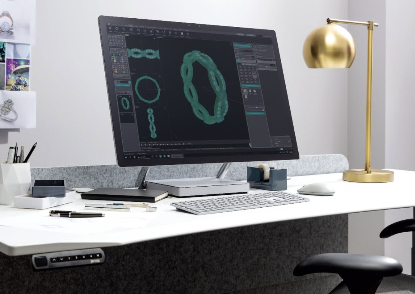
Early in the process, we aligned around a creative theme that captured both technical precision and creative freedom.
Internally, we described it as:
Space Astronaut Toolbox
Materials: metals, rock, rivets
Finishes: reflective, streamlined, futuristic
Movement: weightless and fluid
Lighting: dramatic, high contrast
This direction helped define the visual language — cosmic depth paired with refined metallic surfaces — symbolizing infinite creative possibility powered by engineering precision.
Brand Direction
Identity & Launch System
Building a brand designed to scale across product and marketing
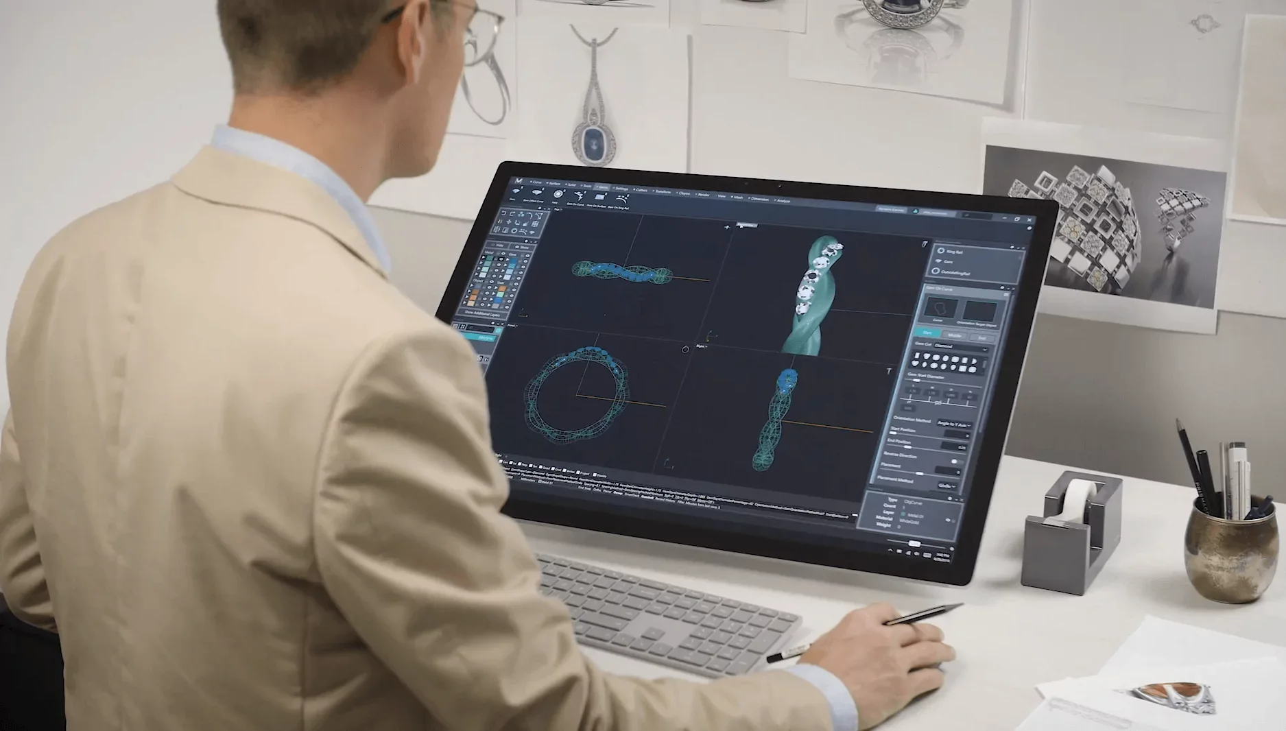
MatrixGold needed to carry forward recognition from Matrix while clearly signaling evolution. I developed a clean, typographic mark anchored by a refined gold accent — reinforcing craftsmanship, precision, and premium positioning.
But the goal wasn’t just a logo. It was a flexible system.
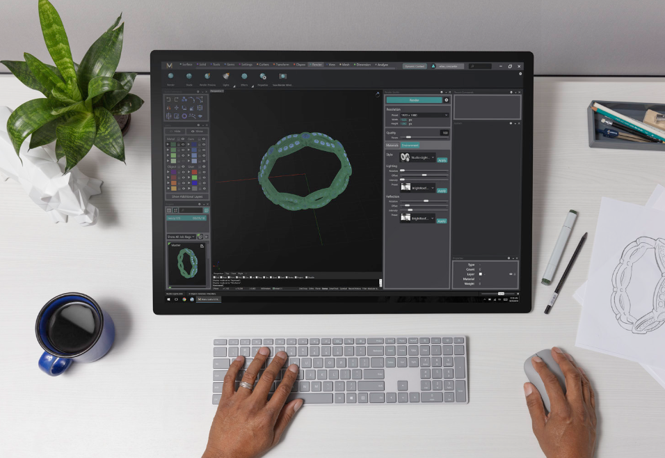
The identity included primary and one-color variations, iconography, Gemvision endorsement lockups, and standards for dark and light environments. From the start, it was built to live seamlessly across software UI, launch screens, advertising, dealer materials, and digital campaigns.
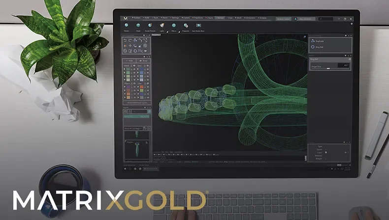
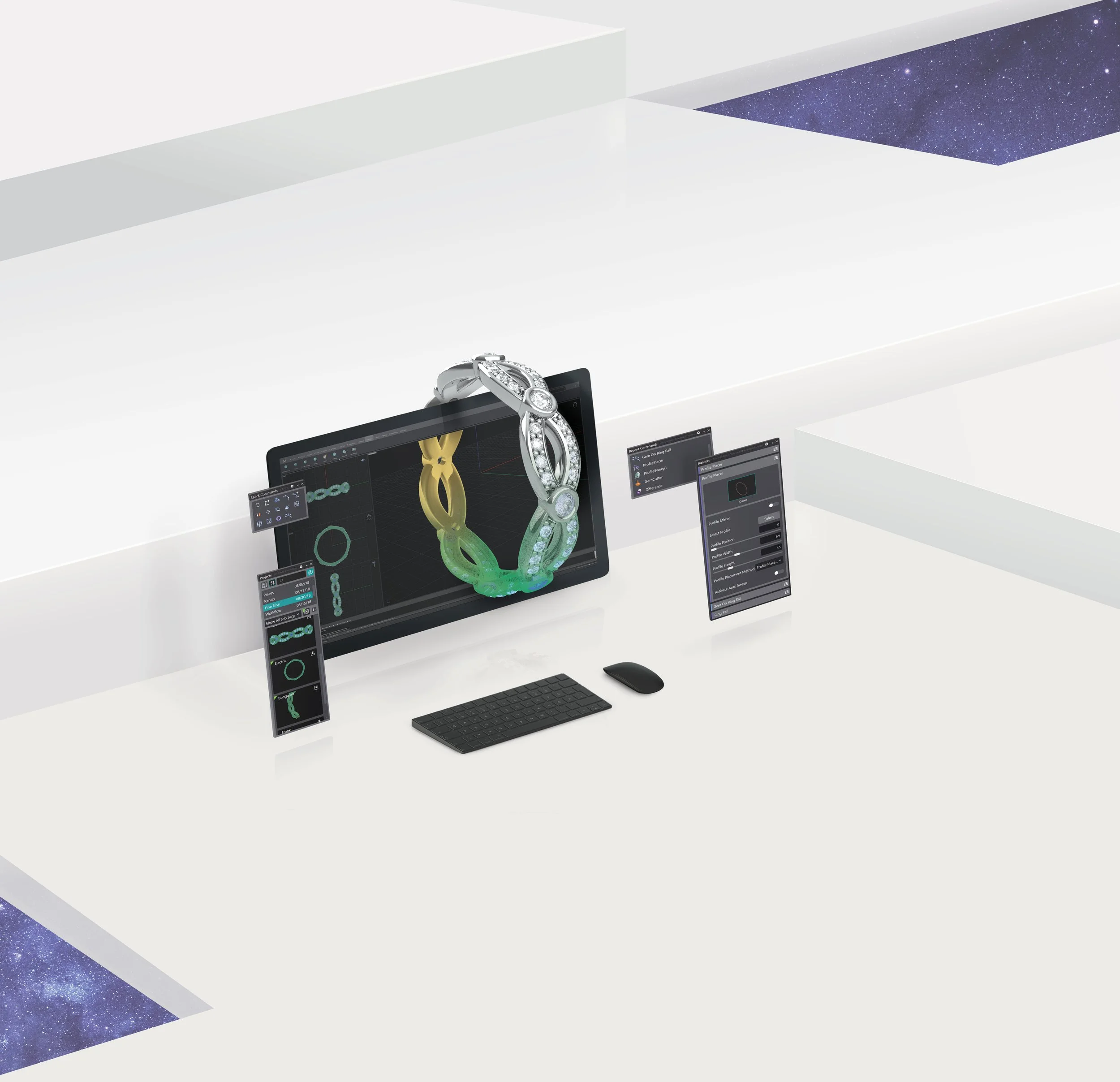
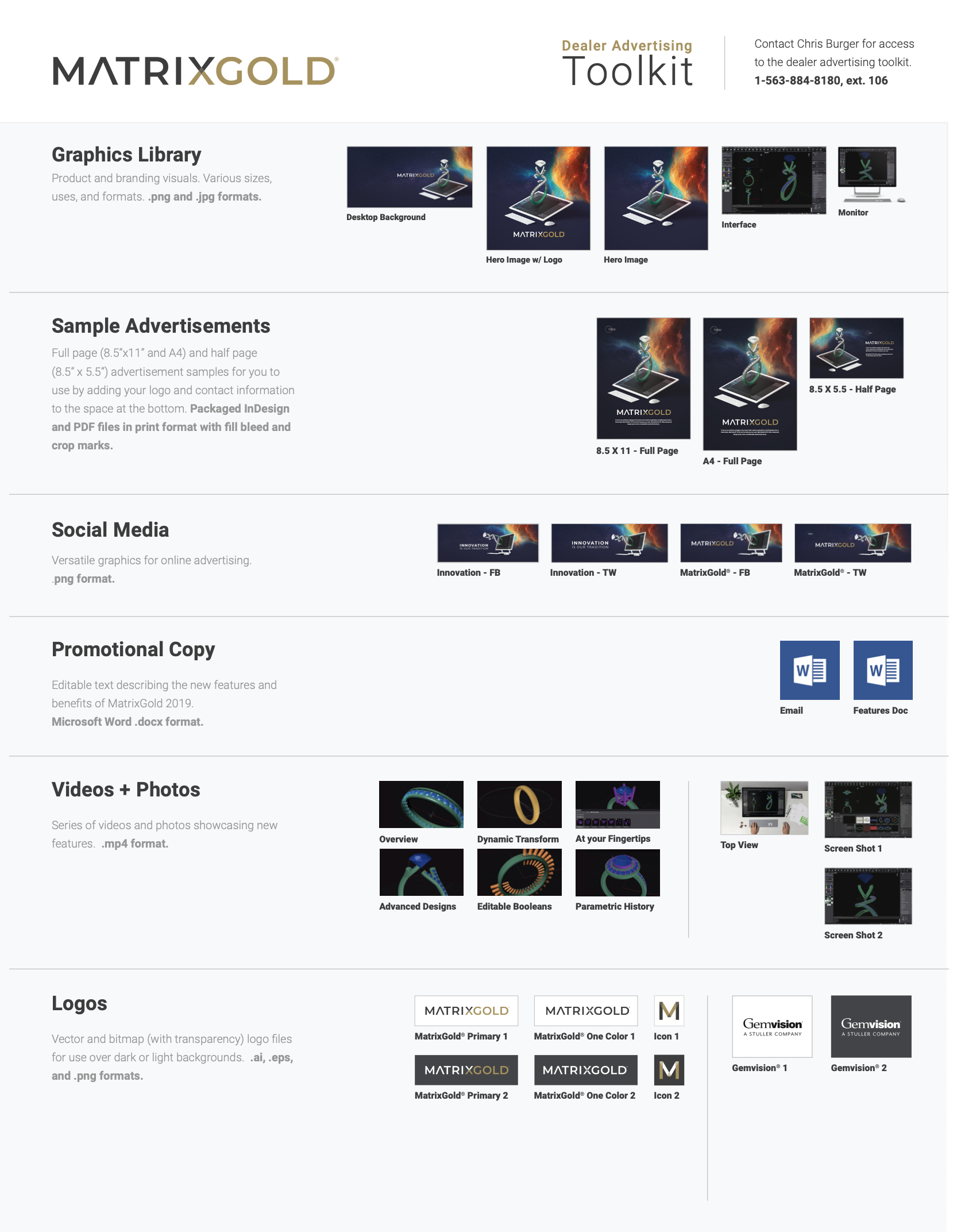
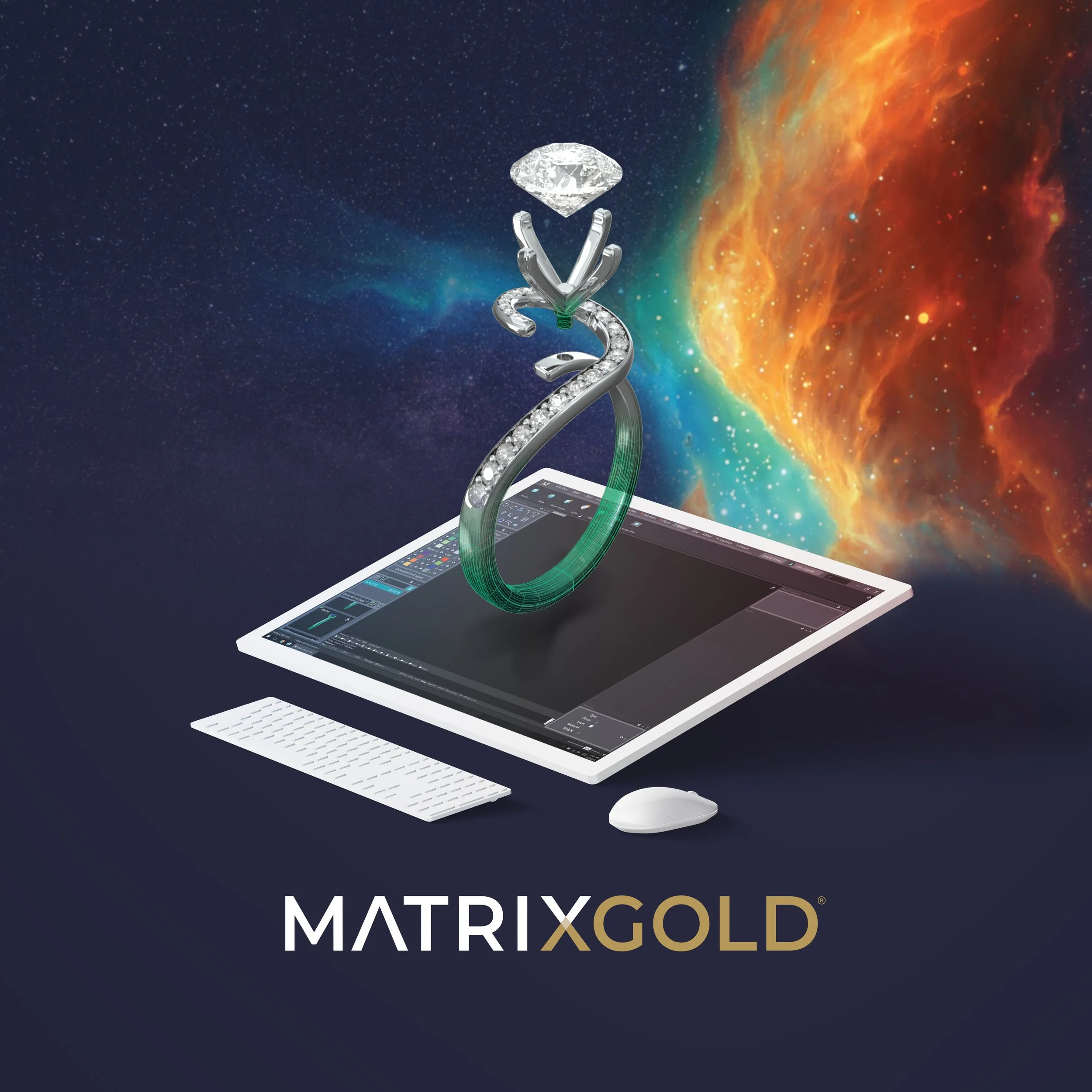
MatrixGold® ToolKit
To introduce the product visually, we created a hero image featuring a 3D jewelry model rising directly from the design interface against a cosmic backdrop. The composition symbolized infinite creative potential powered by advanced engineering.
This visual world became the anchor for:
• Launch screens
• Print and digital advertising
• Social media campaigns
• Dealer marketing toolkits
• Desktop backgrounds
MatrixOne Sheet - MH
Together, the identity and visual system positioned MatrixGold as a confident step forward — not simply a merged product, but a new flagship platform for the future of jewelry CAD.
Impact
Establishing a scalable brand foundation
for long-term growth
MatrixGold launched as a unified platform and continues to evolve today. The creative direction and identity system developed during this phase became the foundation for:
• Ongoing software iterations
• Expanded product tiers
• Dealer marketing programs
• Continued brand refinement
What began as a technical merge became a flagship product with a clear, confident identity.
For me, this project represents more than logo development. It demonstrates brand architecture, product positioning, and cross-functional collaboration in a highly specialized industry — aligning engineering innovation with compelling visual storytelling.